Microsoft today announced that it’s bringing a new user interface design to its Office apps like Word, Excel, PowerPoint and Outlook. This new look will be in line with the Fluent Design System the company launched last year and will roll out to both the Office.com online apps and the Office desktop tools over the course of the next few months.
Besides the overall switch to the Fluent Design System, which is essentially Microsoft’s take on what Google is doing with Material Design, there are three major changes to the design of the Office apps.
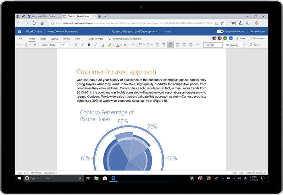
The most obvious is the redesigned and simplified Ribbon — though Microsoft is taking a very cautious approach with rolling this new feature out to all users. While it was a bit controversial when it first launched in Office 2007, most users quickly got used to the Ribbon and Microsoft quickly brought it to virtually all its Windows and online applications. With this update, Microsoft is collapsing the traditional three-row view into a single line that highlights the most important features. Users who want the traditional view can still expand the simplified Ribbon and get that full view.

Microsoft is clearly aware that this is going to be a controversial move, so it’s only launching the new Ribbon for the web version of Word for now. Some Office Insiders will also see it in Outlook for Windows in July. For now, though, the company is holding back on a wider rollout.
“Word, Excel, and PowerPoint on Windows offer our deepest, richest feature set – and they’re the preferred experience for users who want to get the most from our apps,” the company writes in today’s announcement. “Users have a lot of ‘muscle memory’ built around these versions, so we plan on being especially careful with changes that could disrupt their work. We aren’t ready to bring the simplified ribbon to these versions yet because we feel like we need more feedback from a broader set of users first. But when we do, users will always be able to revert back to the classic ribbon with one click.”
The other major visual overhaul here is a new set of colors and icons. Unlike the new Ribbon, these design changes will make their way to all the Office applications soon. The Web version of Word at Office.com will get it first, followed by an Insider release for Word, Excel and PowerPoint on Windows later this month. Outlook for Windows will follow in July, with Outlook for Mac getting it this update in August.
![]()
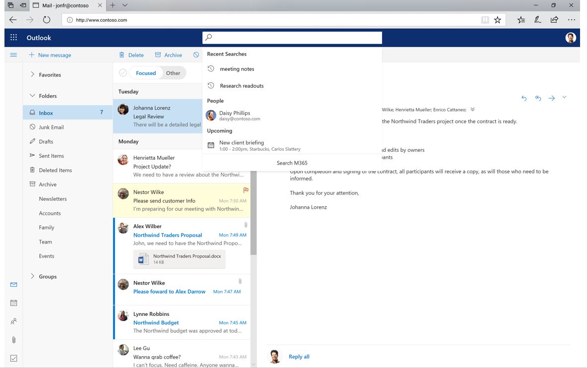
Another new feature that’s less about the design but the user experience is the launch of what Microsoft calls ‘zero query search.” This AI- and Microsoft Graph-powered feature is meant to bring up useful recommendations for your searches every time you place your cursor into the search box. For commercial users, this feature is already live in Office.com, SharePoint Online and the Outlook mobile app. It’ll roll out to Outlook on the web in August.

No comments:
Post a Comment